Responsive Website
Designing
We understand the importance of having a website that looks great and works well on all devices, and that's why we specialize in Responsive Web Designing.

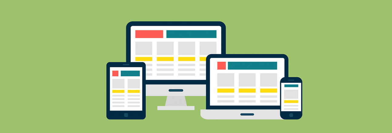
What is Responsive Web Designing?
Responsive Web Designing is a method of designing websites to ensure that they look great and work properly on all devices, from smartphones to tablets and desktop computers. The website's layout automatically adjusts and re-sizes itself to fit the screen size of the device being used. This ensures a great user experience, regardless of whether the user is on a smartphone, tablet, or desktop computer.
Benefits of having a Responsive website
By having a website that is responsive, users will be able to access your website from any device, at any time. This means that you can reach more users, as people are increasingly using their mobile phones and tablets to access websites. Responsive web design also helps boost your search engine rankings, as Google and other search engines prefer websites that are mobile-friendly. At Social Cuppa, we understand the importance of having a website that looks great and works properly on all devices.


FAQ
( Frequently Asked Questions )


Are you looking for a Responsive website?
Social cuppa is here to assist you,we are the laeding responsive website designing agency in London Uk, we understand the importance of having responsive website. Get in touch with us now!